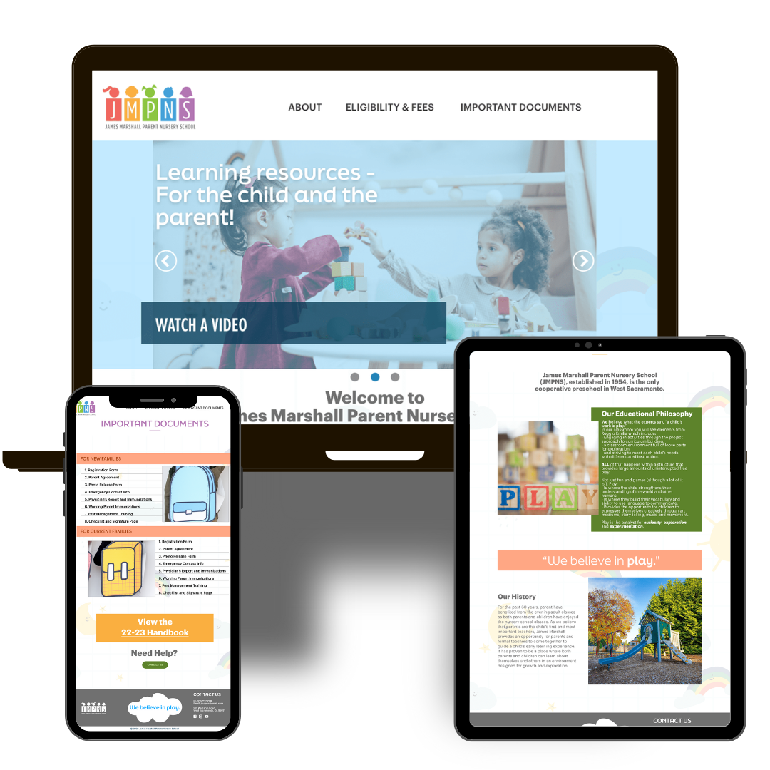
Back to projects
Dec 19, 2023
4 min read

JMPNS Web Overhaul

Improving a website for better navigation

JMPNS WEBSITE REDESIGN


OVERVIEW

How can i make this site more user friendly and visually-appealing?


PROJECT TYPE: RESPONSIVE WEBSITE - WIX CMS • USER EXPERIENCE • USER INTERFACE

Design From the Inside Out

With meticulous attention to detail and a commitment to making something better, I created an easy-to-use, bright, and colorful site that represented what JMPNS is all about - the kids and their parents. Redesigning the website was a UX transformation that enhanced the navigation, infrastructure, and accessibility of the JMPNS site.

User Experience Strategy

I started the process by studying the websites of competitors and role models. This helped me get an idea of what a successful preschool website would look like.

Tools + Techniques

Brainstorming tools, like Coggle, and UX research techniques like a content inventory, card sorting, and persona studies were invaluable in trying to get the perspective from a user and figuring out what was working and what wasn’t. Additionally, dissecting the information architecture was the essential to build a good foundation for the rest of the content.

JMPNS Mockup

Mockup for User Experience Research by Yessi Kenney

THE PROBLEM

The website was cluttered, used a lot of clashing colors, and it was hard to find information. If you want to get a glimpse of what it looked like before, check out the JMPNS Wayback archive page. Some of the things we wanted to execute:

  1. Make the site more mobile-friendly

  2. Update the look and content

VISIT WEBSITE

THE PROCESS

I’ve never thought of myself as a storyteller, but in order to make this an actual UX transformation rather than just a coding project, I needed to put myself in the user’s shoes and empathize with them, and basically come up with stories for the made-up people, I mean personas. I also had to think through and find out who was using the website, other than the parents, so I interviewed the director to see if I could any insight on that.

For the best outcome, a designer should be able to think about who will be using the product and how.

An image that details the various scenarios that a user of the JMPNS website might go through. Part of the user experience research process.

Low Fi Wireframes Something Spreadsheet detailing the contents of the JMPNS website before the redesign.

A chart detailing how the information and pages on a webpage should be organized. A mind map, or brain storm cloud, using Coggle software web app

THE SOLUTION

In a lot of instances, the final product turned out just like I imagined it. In others, it’s totally different and for the better. In many ways, I would do it all over again. It’s a lot easier to find information as a parent, potential parent, or random government worker. The look is also a lot cleaner than it was before. If I were to work on this again, today, I would continue fine-tuning the visual elements - making sure there are no tense tight spaces- pay more attention to how the content and layout work together, and keep tweaking to meet accessibility standards.

Hi Fidelity Mockup

Screenshot of JMPNS website main page, showcasing a header and sslideshow

Another mockup